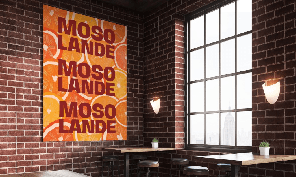
Mosolande

Shape a warm, memorable brand presence for an African supermarket that celebrates naturally grown food, fair access, and the local farmers behind every harvest.
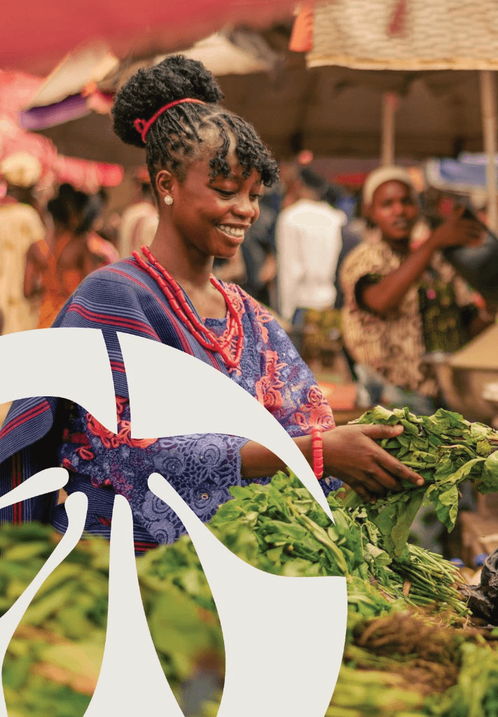
Mosolande is built on a simple belief: good food should nourish families without leaving farmers behind. The brand needed to feel abundant, trusted, and proudly African, carrying the colour, care, and human warmth of the communities it serves.
We positioned Mosolande as more than a supermarket. It is a meeting place between growers and households, where naturally sourced produce, pantry staples, and everyday essentials are made affordable with dignity.
The visual direction leans into rich market energy, earthy food culture, and bold organic shapes. Every image was chosen to feel human first, placing farmers, shoppers, and shared tables at the heart of the brand.
The copy gives the brand a voice with purpose: generous, proud, and practical. It speaks to families who need fair prices, and to farmers whose work deserves visibility, respect, and a stronger path to market.

“Bruce gave Mosolande a voice and visual identity that feels like us. It carries the warmth of our markets, the strength of our farmers, and the promise that good food can be affordable without losing its soul.”